The EVADA shopping app houses some of the most commonly visited high street and online stores, all on one platform. Evada enhances the users online shopping experience by making it easier to discover new trends with the aid tailored features, such as personalised feed.
Evada shopping was initially only available as a web platform for desktop and mobile, however the majority of user’s accessed Evada through mobile. Evada decided to create an app version, to deliver a better user experience by:
Offering better personalisation with customised content for users, a well as help improve conversion rate.
Tailoring notifications for users to stay updated.
Enabling elaborate functions based on advanced gestures like ‘tap,’ ‘swipe’ that you couldn’t do with web.
RESEARCH
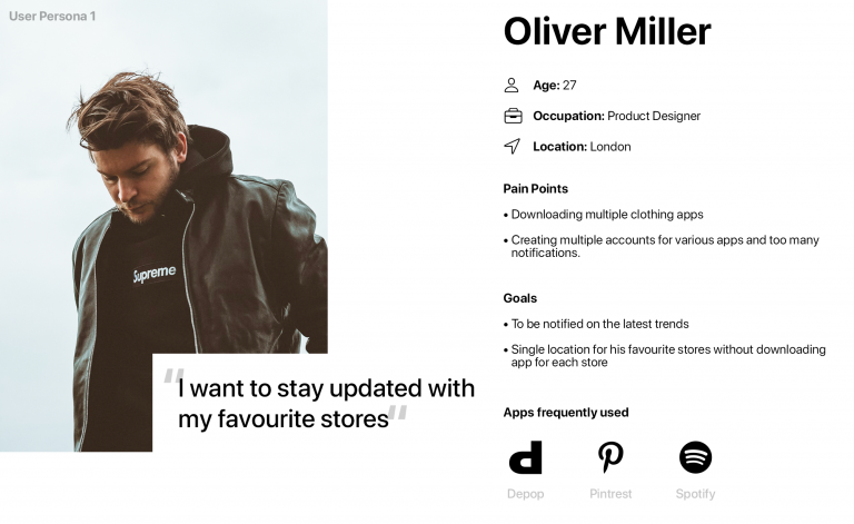
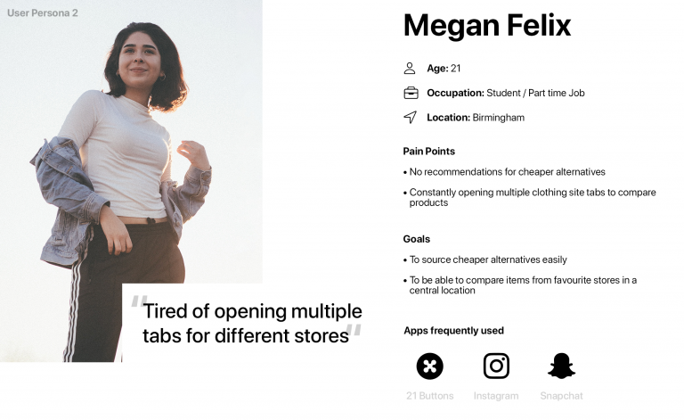
Research enabled me to define and validate the need for the app, as well as get a better understanding of the end users, by highlight existing problems and identifying goals. I utilised previously obtained competitor audits, as well as analytics from Evada’s current website to get a sense of the demographics. From this I was able to send out surveys and then set one to one interviews as follow ups for potential users. This enabled me to create user personas, to highlight specific pain points and goals users wanted to achieve when shopping.
Based on the results from the research and user personas, I was able to identify potential features and opportunities to enhance user experience:
Single location for favourite stores
Compare items from favourite stores in a central location
Stay updated with the latest trends and styles
Recommendations for alternative products
APPROACH
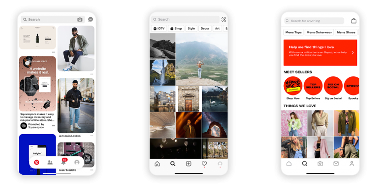
Using the information obtained from research and personas to gain further insights to apps currently used by users. This helped identify specific features and navigations the users were familiar with. For example the key use of a search and discovery page on apps such as Pinterest, Instagram and Depop.
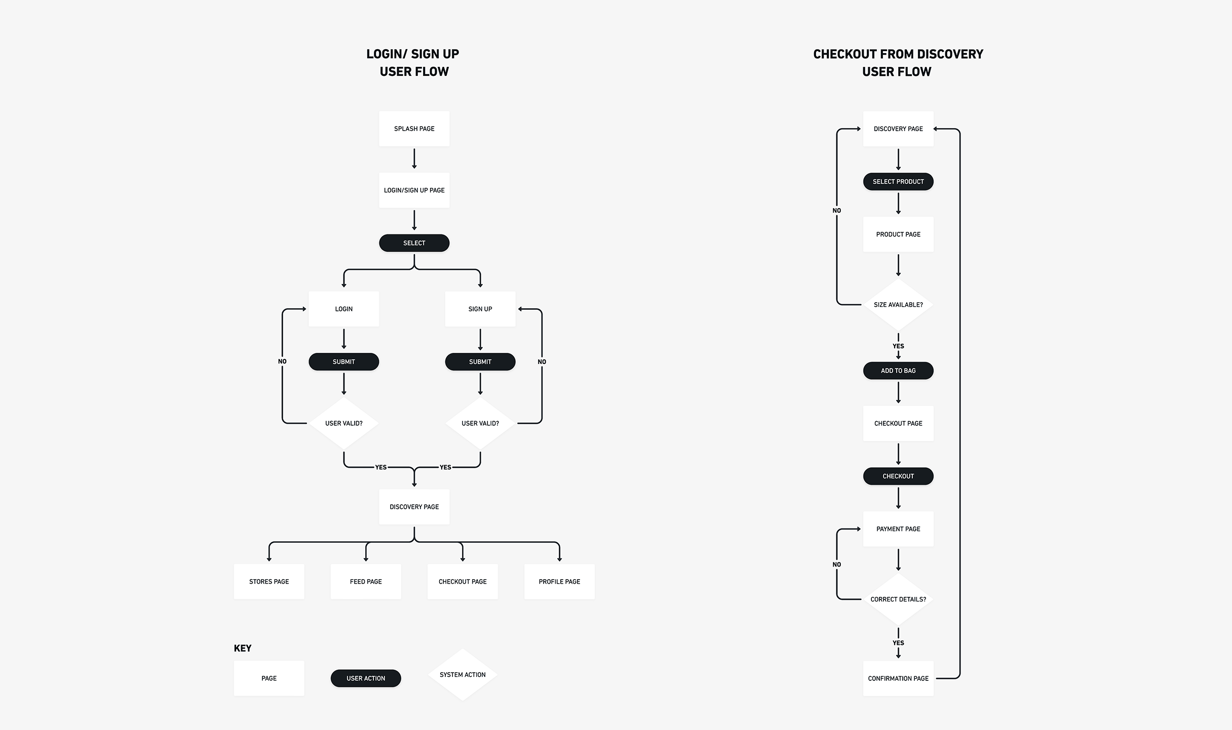
User Flow
With the aid of competitor analysis, user flows were developed to gain a better understanding of how users will pursue certain outcomes when engaging with the product, to make goals as easy and intuitive as possible.
Evada user flows
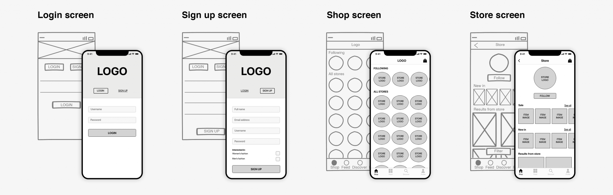
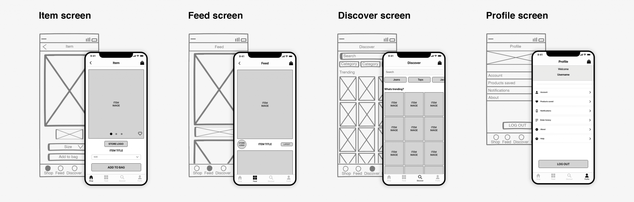
Low Fidelity Wireframe
Low fidelity wireframe mock ups were then created based on results from research. Initially sketched wireframes, which was evaluated by the team and feedback was provided. Iterations were made to create a clickable digital low fidelity prototype to test out the navigation between pages and carry out some usability tests.
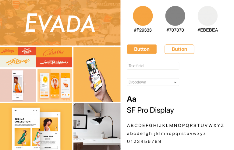
During the design process, I created a mood board to help with the mock up process and define the brand identify, gain direction and inspiration from different styles and motifs.
OUTCOME
Combining the low fidelity wireframe mock ups, mood board and styles, a high fidelity prototype was created.
High fidelity prototype
Once approved, the high fidelity wireframe was passed on to the development team, to create full prototype. Usability testing’s were then conducted, where each user was presented with a task to perform. I observed and took notes on how each user interacted with the app.
General notes from observation
Users found it easy to navigate through app
Majority of users only used store and discover page
Found task straight forward
Request for on boarding when signing up for the first time
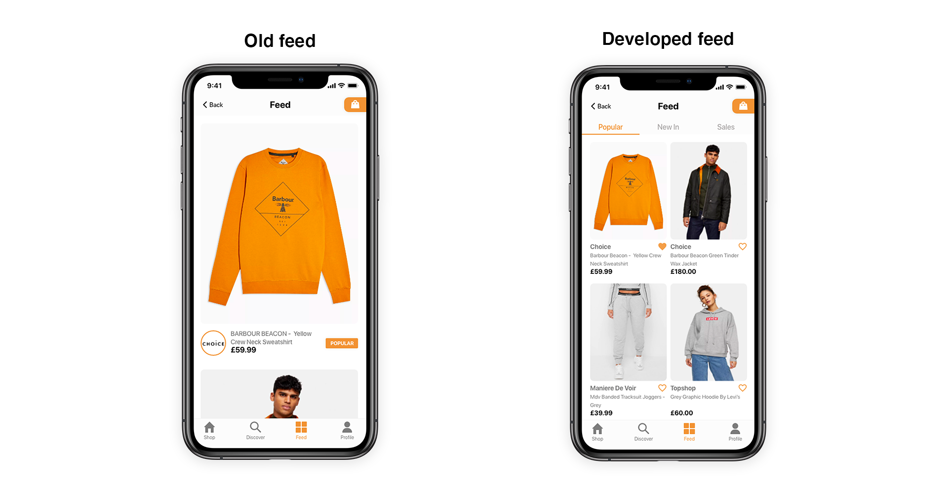
Feed wasn’t really used
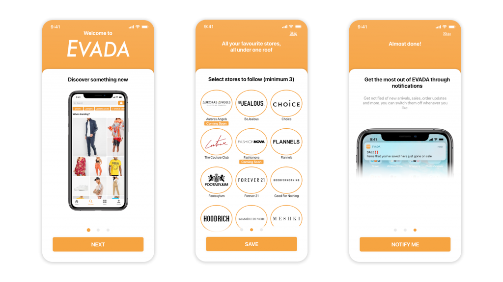
This information was then used to create further iterations to the design and then passed on to the development team. One of the main feedbacks was the need for on boarding at the beginning of the sign up process.
Onboarding process
The initial product feed wasn’t really used by users during testings and wasn’t seen as useful due to limited functionality.
Feed development
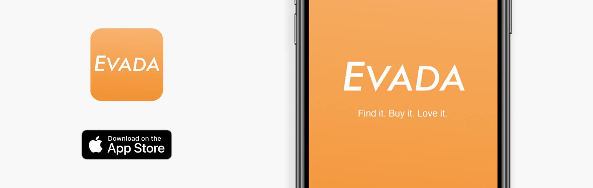
The app has been launched and is now available on the app store, with on-going improvements with the aid of API and data driven design changes based on users.